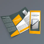
Brochures are a cost-effective way to market your business, as well as provide valuable information to potential customers. A well-designed, brochure is portable, succinct, and captivating. But poorly designed brochures can leave potential customers feeling confused and wary about your business.
Designing an effective brochure is an easy, inexpensive way to market your brand.
But what’s a well-designed brochure? How do you know what to include? And what should it look like?
Our Safeguard designers create unique, cost-effective, and attractive brochures. Here are their top five tips for how to design the perfect one:
-
Have a clear message.
Nothing is worse than opening a brochure that looks aesthetically pleasing only to find it doesn’t have a clear message inside. Before you even begin designing your brochure, consider what the brochure is for. Is it an overview of your company? Is it about a specific product? Know what the focus of the brochure is so your customers won’t be confused.
-
Know your target audience.
Just as when you develop a new product you think about who the product is for, you should also consider who will read it. If an elderly population will read it, consider making the fonts bigger and bolder. If it’s aimed at the millennial population, consider the aesthetics most pleasing to millennials. This will ensure the greatest efficacy of the brochure.
-
Make it easy to read.
While we spend hours considering the best text and design for a brochure, the truth is most people will only flip through it for a few seconds. That means the brochure must be easy to read quickly. Put your most important statements in big, bold font. Limit paragraphs to only three or four sentences. Use a lot of white space. All of this will help communicate your message quickly.
-
Choose an aesthetically coherent design.
There’s nothing more of a turn-off than a brochure with clashing colors, too many fonts, and poorly placed images. By investing in a trained designer, you’ll ensure that your fonts and colors work together not only to appear aesthetically pleasing, but also to subtly communicate your company’s mission through the design.
-
Include a call-to-action.
If someone is reading your brochure, they’re at least interested enough in what you’re selling to spend a few moments learning more about it. By including a call-to-action, you’re making it easy for potential customers to take the next step toward buying your products or service. A simple call-to-action might be a phone number to call or a website with additional information. For example…
…here’s the call-to-action on this blog post!
Call-to-action
Want help designing a cost-effective, aesthetically-pleasing brochure? Your Safeguard consultant and designers can help! Contact us for a free consultation.